Soneks Medical
Aesthetics Spa
Comprehensive audit, competitive analysis, and rebrand strategy prepared by Holly at Neon Canvas
Current Website Audit
An in-depth analysis of Soneks Medical Aesthetics Spa's existing digital presence, identifying strengths, weaknesses, and opportunities for enhancement.

Strengths
- •Clean, elegant design with soft color palette
- •Professional photography including team photos
- •Emphasis on European elegance and personalized care
- •27+ years experience prominently featured
- •Exclusive Age JET treatment highlighted
Opportunities
- •Modernize brand identity with bolder visual system
- •Simplify navigation and information architecture
- •Incorporate social proof more prominently
- •Create stronger contrast and visual hierarchy
- •Develop more distinctive typography system
Key Findings
Soneks Medical Aesthetics Spa possesses a strong foundation with 27 years of pioneering expertise in Memphis laser treatments and European-trained aesthetics. The current website effectively communicates the holistic, personalized approach but lacks the visual impact and modern sophistication needed to compete in today's premium medical aesthetics market.
The soft pastel color scheme, while elegant, does not create sufficient differentiation from competitors. The website would benefit from a bolder, more memorable brand identity that honors the heritage while projecting contemporary luxury and expertise.
Competitive Landscape
Analysis of three primary competitors in the Memphis medical aesthetics market, revealing positioning opportunities and strategic advantages.

Glo Medical Aesthetics
Midtown Memphis
Modern, sophisticated positioning with dark theme creating premium feel. Strong emphasis on expertise, education, and trust. Features treatment planning tool and prominent before/after gallery.

A Beautiful You
East Memphis
Emphasis on affordability and accessibility with tagline "Aesthetics for A Beautiful You, Inside and Out." Video hero section and extensive treatment information with clear pricing signals.

SkinBody Memphis
Germantown
Results-driven positioning with tagline "Where Results Matter." Large team (20+ professionals), comprehensive service menu, and emphasis on newest technology. Multiple locations.
Competitive Advantage
Soneks possesses unique differentiators that competitors cannot replicate: pioneer status as the first to offer laser treatments in Memphis 23 years ago, European training and Scandinavian expertise, and the exclusive Age JET Pure Plasma treatment unavailable elsewhere in the market.
The strategic opportunity lies in modernizing the brand identity to match the sophistication of the service offering while amplifying these unique advantages through bold, memorable visual design and clear messaging hierarchy.
Market Analysis
Memphis demographic data and market opportunity assessment for premium medical aesthetics services.
Target Demographics
The Memphis metropolitan area provides a substantial market base with over 629,000 residents in Memphis proper and additional affluent suburban populations in Germantown, Collierville, and East Memphis. The median age of 34.3 years is particularly favorable, as this demographic increasingly seeks preventative aesthetic treatments and early intervention services.
Soneks' location on Oakhaven Road positions them strategically at the intersection of affluent residential areas and accessible commercial corridors, capturing traffic from both Memphis proper and the wealthy Germantown suburbs where median household incomes significantly exceed the city average.
Market Positioning
The competitive landscape shows moderate density with several established players, yet the market remains undersaturated relative to comparable metropolitan areas. Most competitors focus on similar service offerings, creating opportunity for distinctive positioning as the "Heritage Premium" provider—combining 23 years of pioneering expertise with European sophistication and cutting-edge technology.
New Brand System
A comprehensive rebrand strategy positioning Soneks as the Heritage Premium provider in Memphis medical aesthetics.
Brand Essence
Heritage Premium: For discerning individuals in the Memphis area seeking the highest standard of aesthetic care, Soneks is the premier medical spa that combines 27 years of pioneering expertise with European sophistication.
Unlike fleeting trends, Soneks offers timeless results, personalized care, and exclusive treatments, all delivered in a refined and welcoming environment.
Logo Concept
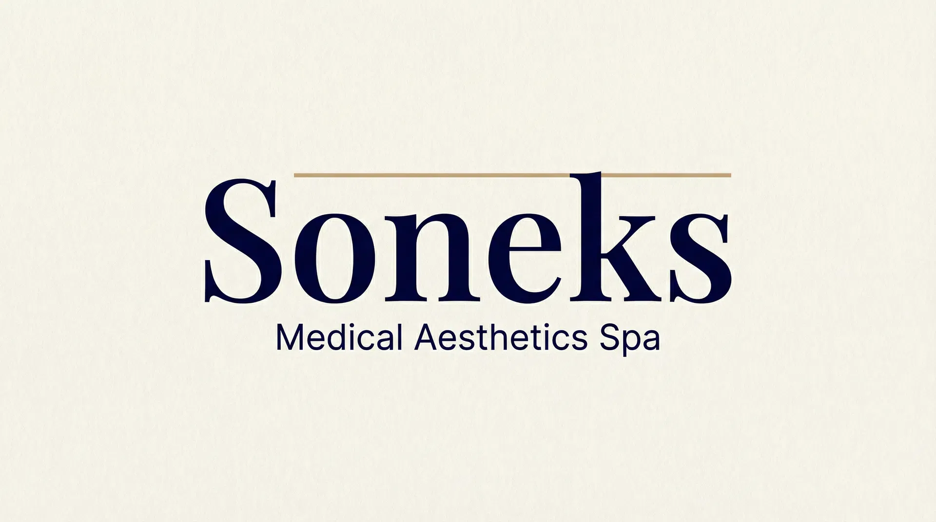
The refined wordmark combines Playfair Display's elegant serifs with a subtle geometric accent in champagne gold. The design embodies heritage and sophistication while maintaining contemporary clarity and timeless appeal.
Color Palette
The palette conveys trust, heritage, and refinement. Midnight Blue anchors the brand with authority and sophistication, while Alabaster provides warmth and elegance. Gold accents add luxury without ostentation, and Dusty Rose offers subtle femininity connecting to personal care.
Typography
Primary typeface for headings and display text. Elegant, classic serif that conveys heritage, tradition, and sophistication.
Secondary typeface for body text and UI elements. Modern, clean sans-serif ensuring clarity and contemporary feel.
Key Messaging
Brand Collateral
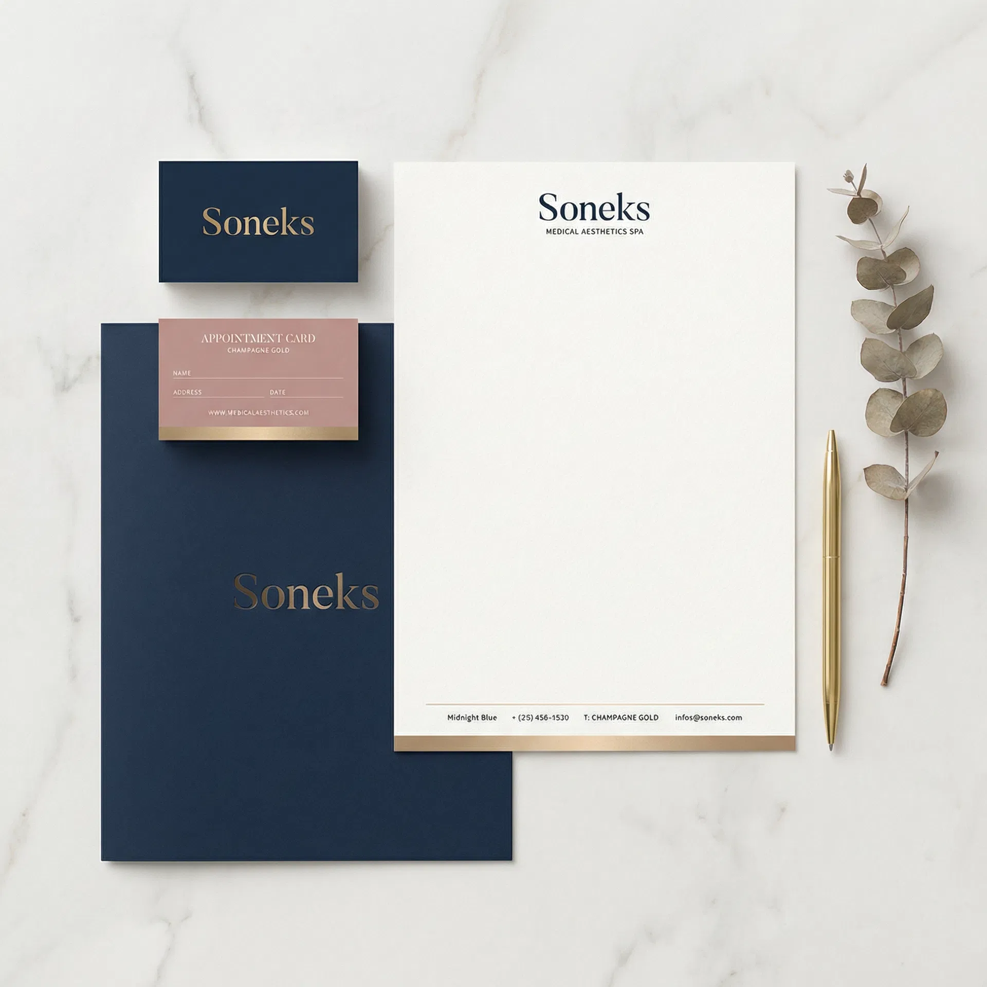
The brand system extends across all touchpoints—business cards, letterhead, appointment cards, and brochures—maintaining consistent visual language and premium materiality. Each piece reinforces the Heritage Premium positioning through refined typography, restrained color palette, and sophisticated layout.
Homepage Design
A sophisticated, editorial-style homepage that embodies the Heritage Premium positioning through refined typography and systematic layout.
Homepage Hero Section
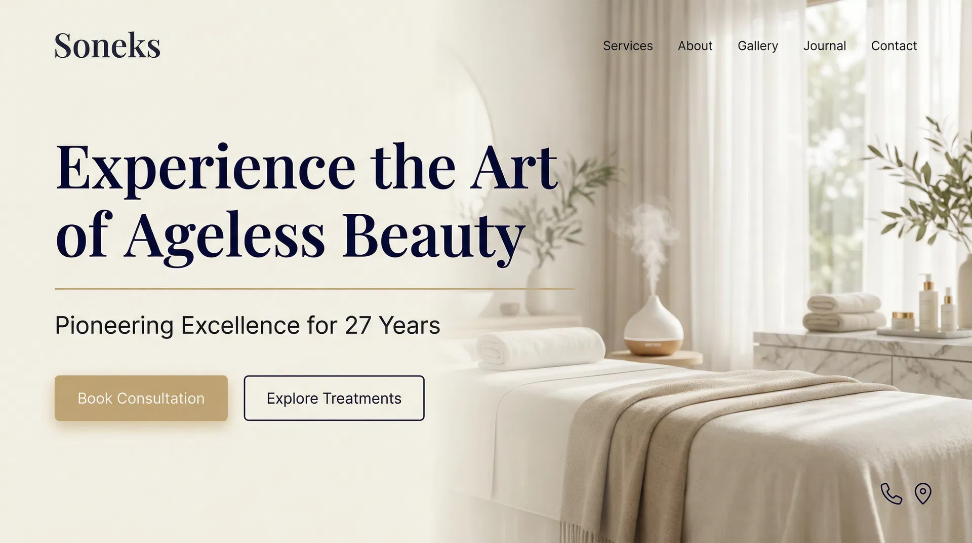
The hero section immediately establishes the Heritage Premium positioning with elegant serif typography, sophisticated color palette, and serene spa imagery. The gold accent line and dual CTAs guide visitors toward engagement while maintaining refined aesthetic.
Signature Treatments Section
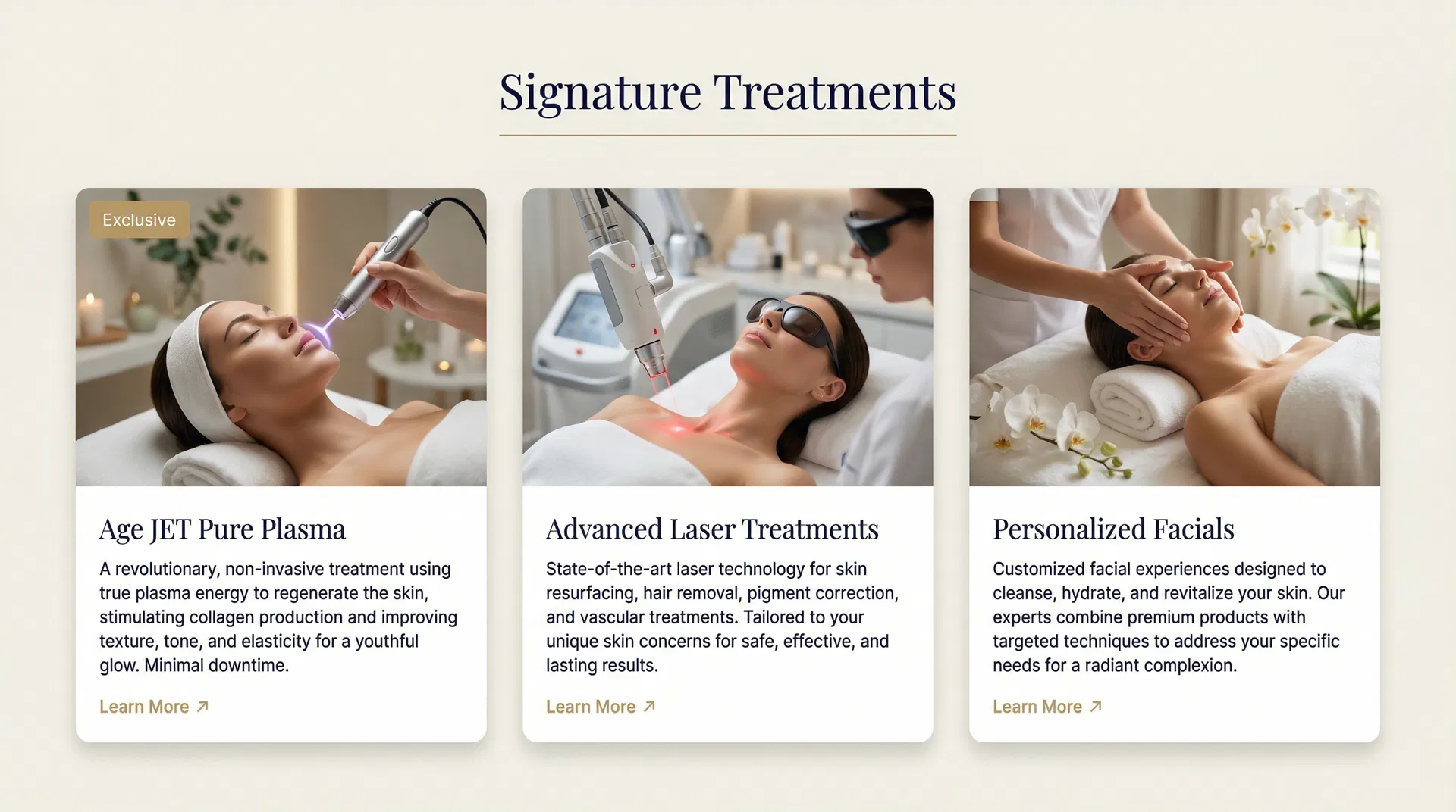
The services section showcases signature treatments in a clean grid layout with high-quality imagery. Each card provides clear treatment information with gold "Learn More" links, maintaining visual hierarchy and encouraging exploration.
Mobile Experience
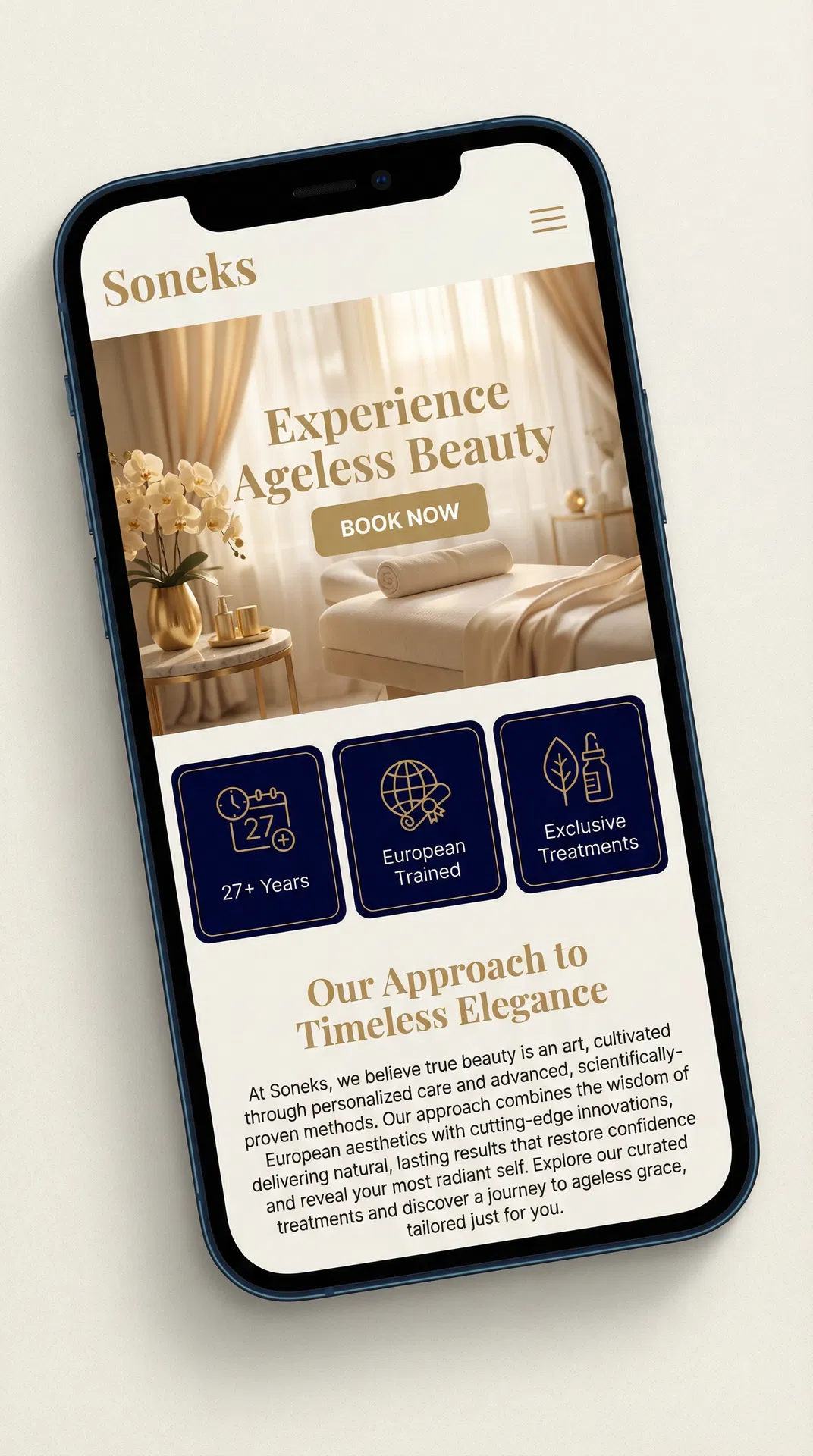
The mobile-first design ensures the Heritage Premium experience translates seamlessly to smaller screens. Trust indicators, clear CTAs, and elegant typography maintain brand integrity across all devices.
Design Philosophy
The new homepage design embodies Swiss Modernism meets Editorial Luxury—combining timeless elegance with modern functionality. The design balances sophistication with warmth, creating an inviting yet refined digital experience that reflects Soneks' 27 years of expertise and European-inspired approach.
Homepage Sections
Key Differentiators
Sophisticated Palette
Midnight Blue and Gold create a more premium, memorable impression than competitors' generic light schemes.
Heritage Storytelling
Emphasis on 27 years of expertise and pioneer status, which competitors cannot match.
European Elegance
Refined typography and design language reflecting Scandinavian training and sophisticated approach.
Exclusive Treatments
Prominent featuring of Age JET as unique offering unavailable elsewhere in Memphis.